Haleon Pain Index

Unlocking a decade of insights with an interactive, story-driven tool.
Client

Haleon

Project typeWebsitesDashboards

Pain is a universal human experience. Yet it’s too often dismissed, stigmatised or misunderstood. Over the past decade, the Haleon Pain Index has surveyed over 80,000 people around the world to uncover how pain truly affects our lives.

But data is only truly useful if people can access it, explore it and make sense of it. Haleon asked us to create an interactive website that would open this data up to the world for the first time.

Unlocking a wealth of insights, we’ve created a new interactive website that makes it possible to fully explore this invaluable data.

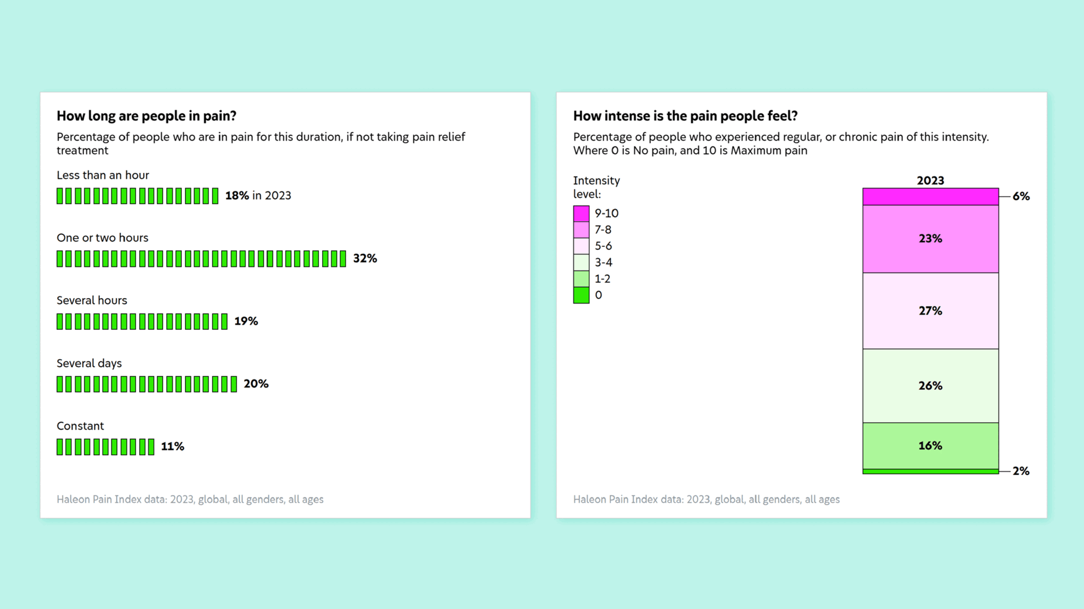
Across the world, 44% of people experience pain on a daily basis. Beginning at this startling global view, users can filter by year, country, gender and age to see the data that matters most to them.

This is an interactive tool driven by data storytelling. Every data set is brought to life with a variety of engaging, clear visualizations, making it easy to see how the impact of pain differs by nation or demographic area and how trends shift each year.

For the first time ever, policymakers, journalists and researchers now have a simple, dynamic way to explore, understand and use this data.

We also wrote think-pieces for the site that dive into important topics, such as why people delay treating their pain, how healthcare access impacts pain management and the economic impact of pain.

One of the charts from the page, titled 'Where on the body do people experience pain?'. It shows a body shape in the middle with point highlighted on it for various pain points. On the left and right are line charts for each pain points showing pain over time.
Two charts from the page. The first is titled, 'What types of pain are most common?' and shows a scatter plot for the percentage of people who experienced earache over time. The second, titled 'People are more likely to talk to colleagues than employers about managing their pain', with a comparison of the percentage for colleague and the percentage for employer.
Two animated charts from the page. The first is titled, 'How long are people in pain?' and shows a bar chart for each level of pain and compares 2023 with 2019. The second, titled 'How intense is the pain people feel?', showing a stacked bar chart comparing the intensity levels of 2023 with 2019.

Get in touch:hello@beyondwordsstudio.com

beyond words logo
Follow us
LinkedInInstagramYouTube
Find us
Beyond Words Studio UK 91 Brick Lane London, E1 6QL
Beyond Words Studio US Florida, USA
Beyond Words Studio EU Dublin, Ireland
Copyright Beyond Words Studio Ltd. 2025

Our use of cookies

We need to use a few cookies to make our website work. We’d also like to set some analytics cookies that help us improve our site by showing us how you use it. But these will only be set if you accept. For more information, see our Cookies page.